UX/UI of the marketing suite
in 2019/2020
Overview
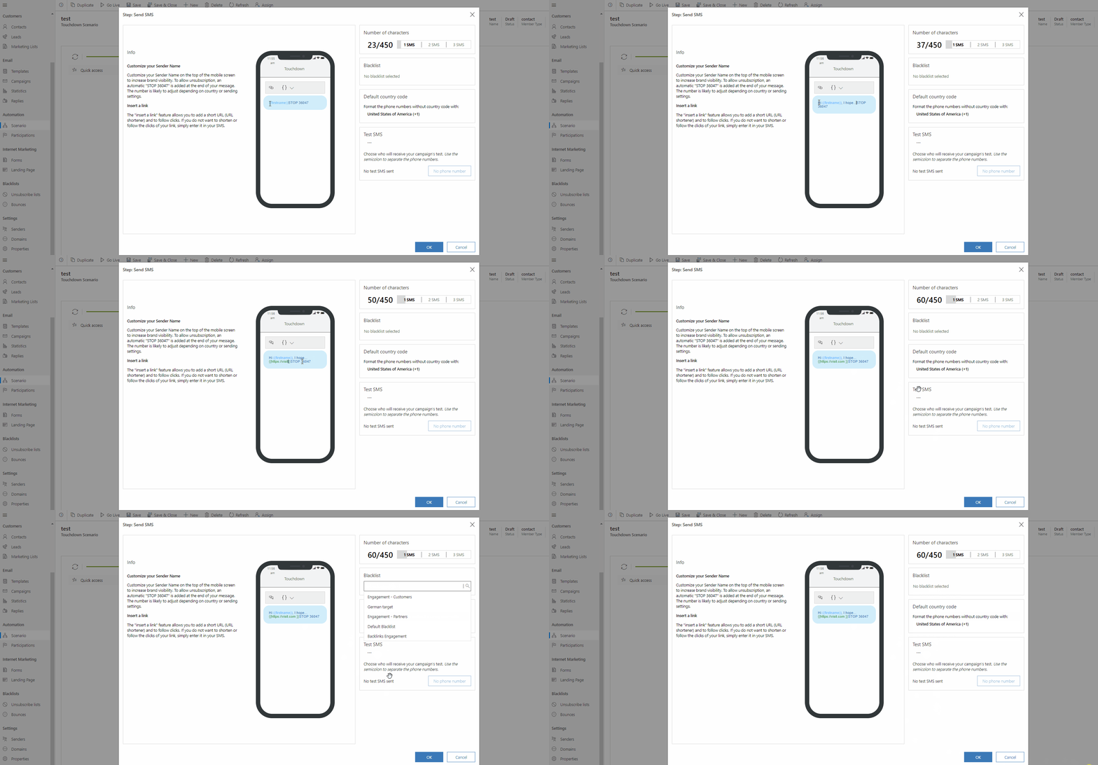
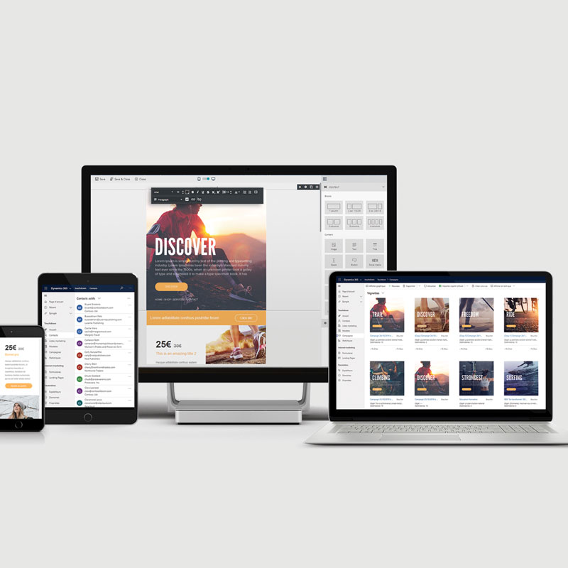
Touchdown is a user-friendly intuitive marketing automation solution for Microsoft Dynamics 365 & PowerApps. It is a global solution for email marketing, sales, SMS marketing, automation, and transactional email. The software itself exists since the year 2001 under the name Sarbacane Software (Mailify on the international market). I worked with a team of developers and collaborated on the UX/UI design with my colleagues.
Problem statement
Our users who primarily use complex CRM interfaces should have an access to an intuitive option for their sales and marketing purposes within the Microsoft Dynamics 365 apps. The main challenge is to create UX-friendly bricks of the interface to allow users who vary from amateurs to experienced marketers to have an access to an intuitive app. Another challenge then was to enable Microsoft integrators to integrate the Touchdown interface according to their clients’ needs.
Tools used
- Whiteboard (low-fidelity prorotypes)
- Adobe XD (mid & high-fidelity prototyes)
Market Research
To create a product and a brand that will position itself on the market, I needed a deep understanding of the Microsoft ecosystem and its partners, understand the competitivity of existing solutions and create a value proposition as a blueprint for the operational marketing strategy.
User Research
In order to deliver a successful suite a deep understanding of the users and partners was needed since Touchdown had to be deployed to an existing Microsoft Dynamics 365 environment via an integrator.
We hence focused on the research from different angles by breaking down our products and services; pain relievers and gain creators versus their job, pains, and gains:
- Digital consumers – users in job roles who use marketing tools for communication, customer service, or marketing campaigns
- Digital end-users – users who will receive the communication (in a form of an email or SMS) via Touchdown
- Digital partners – indirect/direct users who will further deploy Touchdown into Microsoft Dynamics 365 for their clients (need to be convinced by the look and the functionalities of the app)
- Microsoft partners – indirect users who will notice the value of the solution and its contribution to the Microsoft products
Research goals
- Deep understanding of the users’ job (4 types of users)
- Deep understanding of their pains
- Deep understanding of their gains
Research findings
- Digital consumers & Digital partners – encounter switching costs if another solution is to be used, company values are not in line to use Microsoft Dynamics 365, data synchronization problem and marketing tools which are difficult to use
- Digital “end-users” – receive too much information, broken links, images not showing or not responsive content, etc.
- Microsoft partners – limited existing alternatives for marketing solutions within Microsoft Dynamics apps, convincing existing users to switch can be costly for clients
User Information
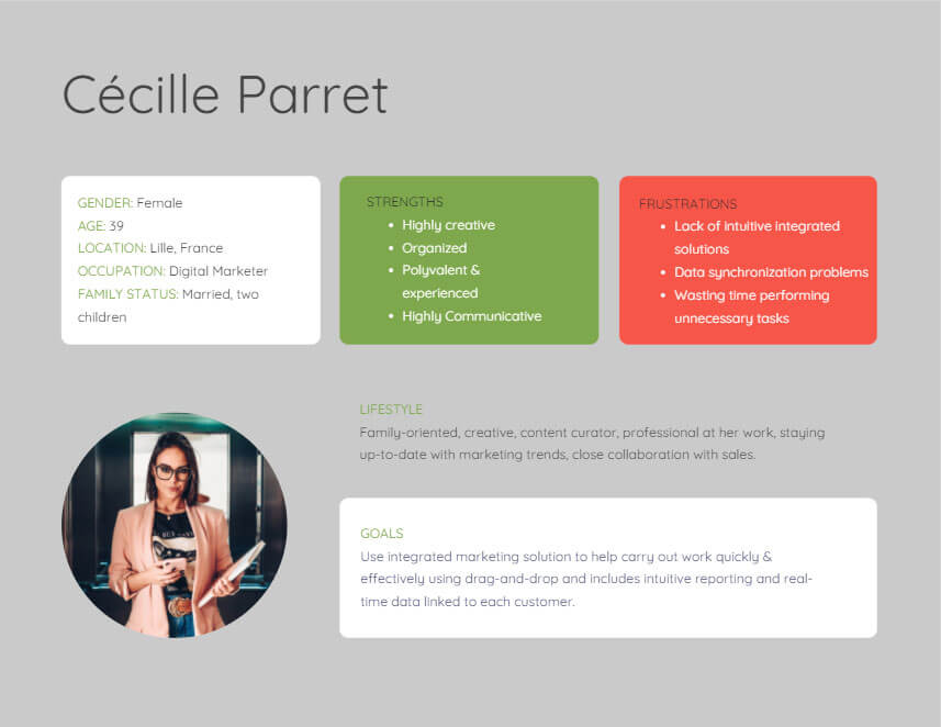
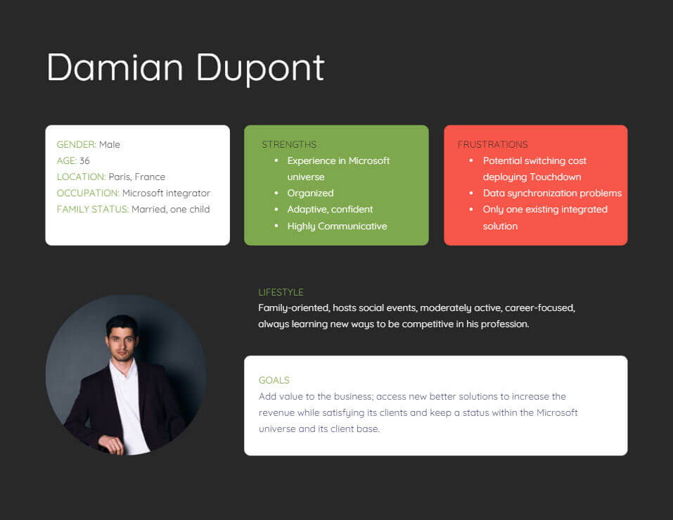
User personas
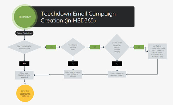
User flow
Prototyping
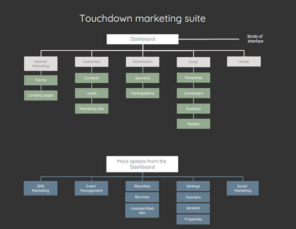
Sitemap
Low-fidelity prototype
To save some time I used a whiteboard for some of the prototyping. I did not draw the whole app just some of the app’s functionalities. I still find this step to be the first I aim for as it is efficient and the quickest to launch the prototyping while thinking through visualization.
High-fidelity prototype
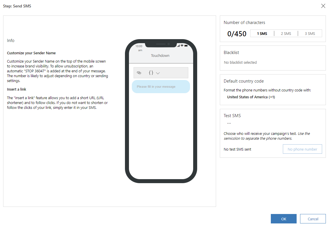
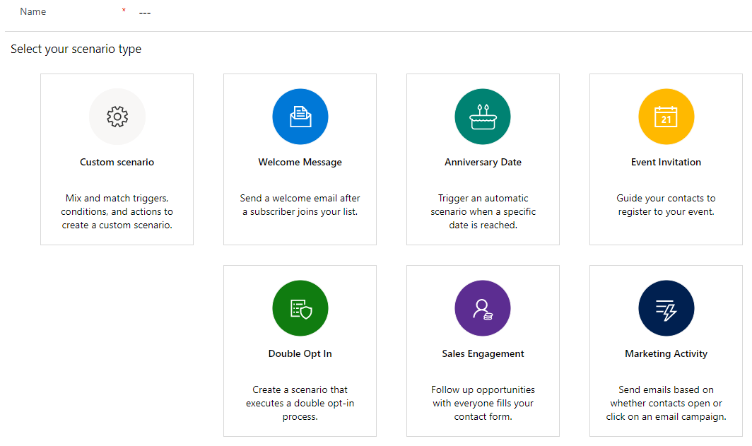
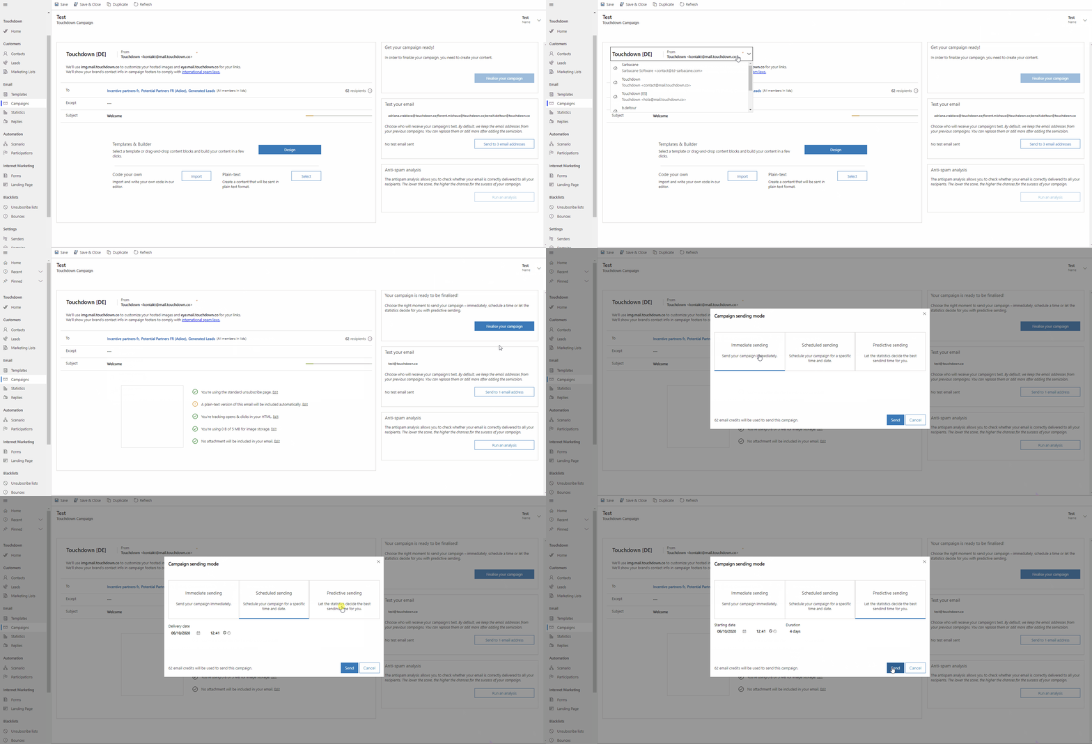
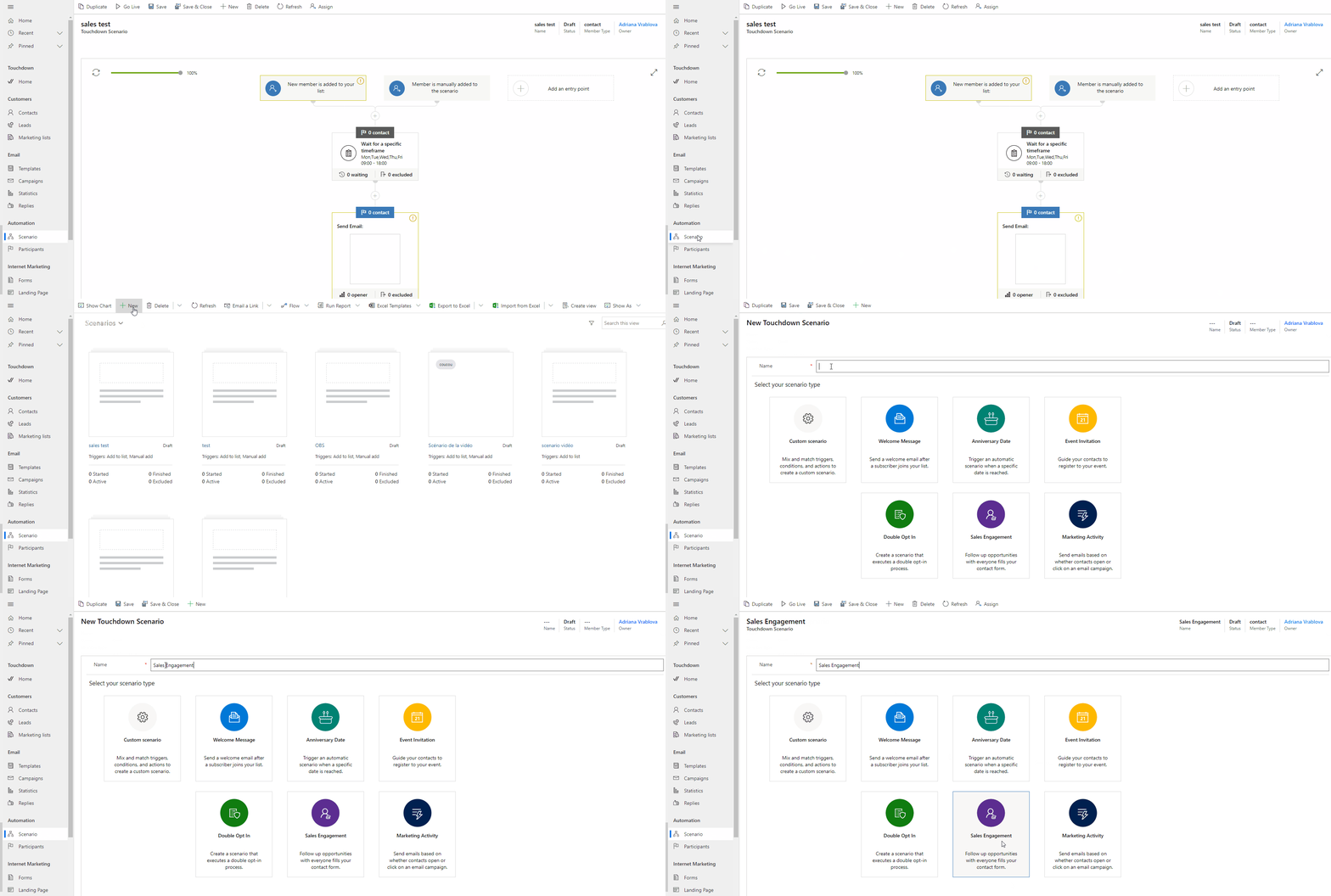
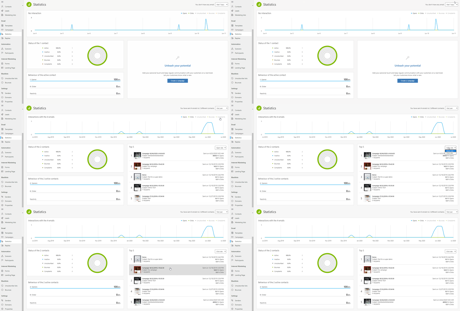
Based on our research we knew we had to focus on every detail and introduce the importance of microcopy through which we could seamlessly guide the user to get their task done. I was responsible for the English part of the microcopy and my colleague for the French part. Together we collaborated on High-Fidelity prototypes using Adobe XD where we designed the interface within the Microsoft-inspired design in terms of fonts and icons.
Usability Testing
Goal
- Answer the customers’ needs in the best way possible without sabotaging the email and communication experience of the end-user.
- Since I was working very closely with the sales team and was personally using Touchdown for the marketing communication with our own clients while providing user feedback, reporting bugs, and interface suggestions.
Test objectives
- Observe user thinking during navigation and collect feedback for further adjustments.
- Get insights on clients’ MD 365 customized layouts and how Touchdown can fit even better within the services they use.
- Detect the best combination of the provided features as possible.
Methodology
- Passive contextual inquiries – Done during the different stages of development. The subjects were Microsoft integrators who use existing email marketing solutions and were testing our suite within their Dynamics environment. They would then decide whether our solution would appeal to their clients. After their testing period, they were asked a set of questions during an interview where they could provide precisions about their experience.
- Active contextual inquiries – Interview conducted on ten subjects representing final users of Touchdown. I have afterward reported the results to the whole team to adapt the product backlog.
Final Design
What did I learn?
- I have gained a tremendous amount of experience, from in-depth market and user research to creating prototypes, and content and adapting microcopy to improve the UX respecting the guidelines of Microsoft universe.
- Overall, the Touchdown experience helped me shape my skills and detect what job I am made for, and follow this endeavor.
- If however, I could improve on some of the limitations due to lack of time and human resources, I would conduct more usability tests.

