UX/UI, localization for website
in 2019/2020
Overview
Touchdown is a user-friendly intuitive marketing automation solution for Microsoft Dynamics 365 & PowerApps. It is a global solution for email marketing, sales, SMS marketing, automation, and transactional email. The software itself exists since the year 2001 under the name Sarbacane Software (Mailify on the international market).
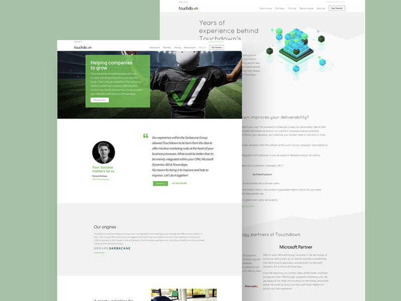
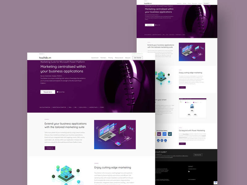
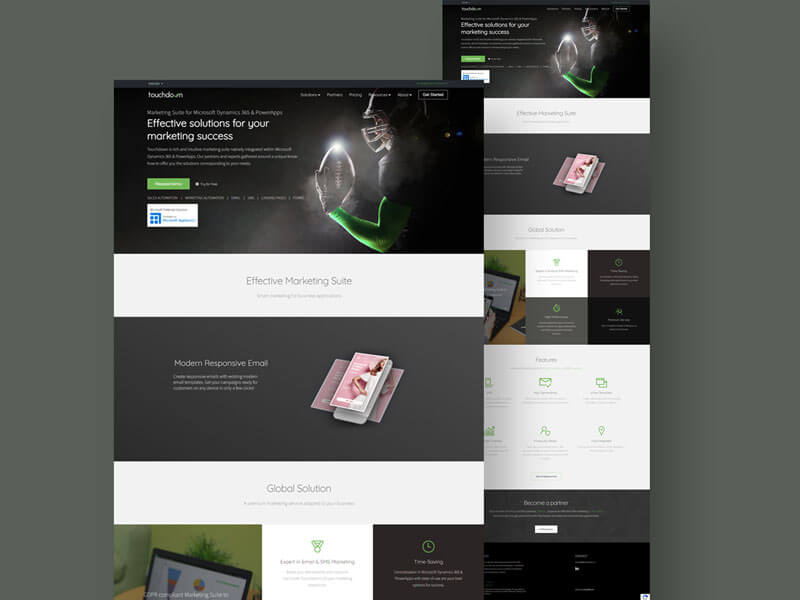
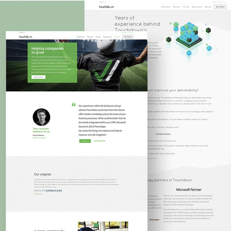
Using UX/UI, I designed the showcase website with a team of web developers and a graphics team helping us put together an ergonomic showcase website. The project preparation included localization practices for English and German.
Problem statement
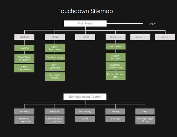
Create an ergonomic website representing comprehensive information architecture for different types of our audience.
The challenge was to combine the sphere of a premium solution with the Microsoft environment to keep a certain connection for all our partners and stakeholders and strategically place the right information in the right place.
Another challenge was to repeat this for the localization of the website into German and French, the website was initially designed in British English since the solution is European.
Tools used
- Paper (low-fidelity prorotypes)
- Adobe XD & Figma (mid & high-fidelity prototyes)
- Elementor (WordPress visual page builder plugin)
Market Research
The market research was being conducted at the same time as the research for the software itself, however, with a higher focus on the web navigation alongside other aspects. Please find more information on this link.
User Research
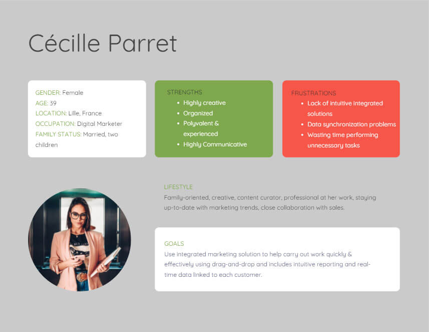
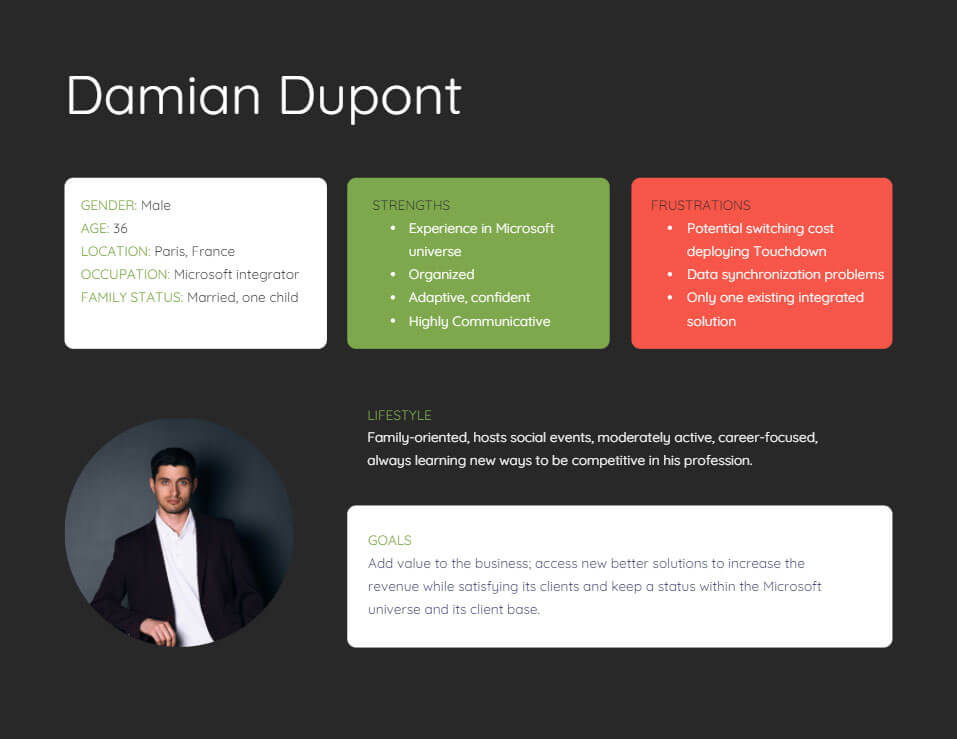
To deliver a successful website a deep understanding of the users and partners was needed since Touchdown had to be deployed to an existing Microsoft Dynamics 365 environment via an integrator.
We hence focused on the research from different angles by breaking down our products and services; pain relievers and gain creators versus their job, pains, and gains:
- Digital consumers – users in job roles who use marketing tools for communication, customer service, or marketing campaigns
- Digital end-users – users who will receive the communication (in a form of an email or SMS) via Touchdown
- Digital partners – indirect/direct users who will further deploy Touchdown into Microsoft Dynamics 365 for their clients (need to be convinced by the look and the functionalities of the app)
- Microsoft partners – indirect users who will notice the value of the solution and its contribution to the Microsoft products
Research goals
- Deep understanding of the users’ job (4 types of users)
- Deep understanding of their pains
- Deep understanding of their gains
Research findings
- Digital consumers & Digital partners – need to be able to quickly differentiate the information dedicated to them respectively to convince them Touchdown will help them solve their frustrations
- Digital “end-users” – every person is touched by marketing campaigns, the website can help demonstrate good practices, the users are looking for today
- Microsoft partners – limited existing alternatives for marketing solutions within Microsoft Dynamics apps, the website must mirror their interest the suite offers
User Information
User personas
User flow
Prototyping
Sitemap
Low-fidelity prototype
To save some time I used paper for some of the prototyping. It did help me visualize information architecture as well as compare some of the designs to proceed with the prototyping of higher fidelity. I still find this step to be the first I aim for as it is efficient and the quickest to launch the prototyping while thinking through visualization.
High-fidelity prototype
Based on our research we knew we had to focus on every detail and keep the information flow light while encouraging certain strategic navigation for information and conversion. I worked on the mid-fidelity prototyping in Adobe XD, which later on turned into Elementor for high-fidelity prototyping. It was a time-saving practice helping immediate testing, adaptation, and publishing.
The Importance aspect was to preserve a centralized set of designs with the software, like for example icons & count on longer titles and text placements for the German market.
Usability Testing
Goal
- Answer all the types of website users’ needs and information flow in the best way possible without sabotaging or preferring one type of user over the other hence ensuring a pleasant UX.
- I was working with a big variety of specialized teams this way I could obtain a variety of testing subjects and compare their results. The goal was to implement the changes rapidly myself and continuously repeat the process until necessary. I would, however, report more complex fixes to the web developing team.
Test objectives
- Observe user thinking during navigation and collect feedback for further adjustments.
- Rapid deployment of the notified changes.
- Help create a website with significant conversion ratios.
Methodology
- Passive contextual inquiries – Done during the different stages of development. The subjects were French, English, and German-speaking to gather feedback on all the website versions. After their testing period, they were asked a set of questions in an email or verbal exchange depending on the possibilities.
- Active contextual inquiries – There were also a few interviews conducted representing the target of the potential Touchdown users. I have afterward reported the results to my team and either adapted changes myself or referred to the web dev backlog.
Final Design
What did I learn?
- This experience was very enriching. I got the chance to collaborate with many different people. I deepened my knowledge of cross-team collaboration and approach and became more confident in taking initiative while trusting my decision-making.
- Overall, the Touchdown experience helped me shape my skills and detect what job I am made for, and follow this endeavor.
- However, if I could improve on some of the limitations due to lack of time and human resources, I would definitely conduct more usability tests focused on Microsoft partners.

